A Comprehensive Guide to React Icons with Illustrative Examples
As the title implies in this article we will learn how to incorporate React Icons library into our React project for displaying icons.
Utilizing vibrant and colorful icons is an excellent approach to improve the user experience of your React project. In addition to enhancing the appearance of your app, icons can provide a contemporary and polished aesthetic to your website.
Moreover, icons are a space-saving solution for designers and they offer a universal familiarity for both users and developers.
Consider the following example; which do you believe looks more visually appealing?
This text:
Or this icons:
The widely used library for rendering icons in React is React Icons. This user-friendly library simplifies the process of rendering icons in our application.
Let's get started for todays lession.
First run the following command on your project:
npm install react-iconsNow, we need to import it to our component.
import {RiHeadphoneFill} from "react-icons/ri";Here is a basic sample example:
return (
    <div>
        <p>
            Let's entertain you with some <RiHeadphoneFill />
        </p>
    </div>
);
And the resulted output is:

Note that each icon package has its own subfolder. For example, if we want to get icons from the Flat Color Icons, then we should use the following import:
import { IconName } from "react-icons/fc";Similar to previous implementations, you can import your icons as follows:
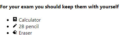
import {RiCalculatorFill, RiEraserFill, RiPencilFill} from "react-icons/ri";Here, we have imported our icons from the Remix Icon.
To render it, write the following code in your component’s return block:
return (
        <div>
            <h4>For your exam you should keep them with yourself</h4>
            <ul>
                {/*add with text */}
                <li><RiCalculatorFill /> Calculator</li>
                <li><RiPencilFill /> 2B pencil</li>
                <li><RiEraserFill /> Eraser</li>
            </ul>

        </div>
    );
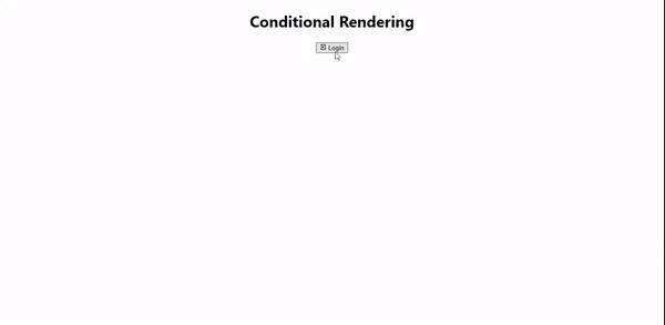
We can also conditionally show and hide or swap our icons. Here is an example:
const [isLogged, setIsLogged] = useState(false);

return (
        <div>
            <h1>Conditional Rendering</h1>
            {/*show with icons*/}
            <button onClick={() => setIsLogged(!isLogged)}>
                {isLogged ?
                <>
                    <RiLogoutBoxRLine/> Logout
                </> :
                <>
                    <RiLoginBoxLine/> Login
                </>
                }
            </button>
        </div>
    );
Here, we declare the isLogged Boolean, which will make conditional rendering possible. And whenever we toggle the value true and false
it renders the possible output whether it should be Logout now or a Login button.
Here is the sample output:
That's for today. Thanks for reading.