JavaScript Build a Responsive Navigation Menu
Hello dev's, today I'll show how to build a responsive navigation menu with only CSS and JavaScript. We often used to use any framework like Bootstrap or Tailwind CSS to create a navigation menu. It's a simple and easy to integrate. Let's see how we can easily build a responsive navigation menu using pure CSS and JavaScript.
We'll configure our HTML with the necessary HTML, CSS, and JS. We'll show them one by one and see the explanation. And in the last, we'll show the output.
First, we'll set up the HTML part.
<header>
<nav id="mainNav">
<ul>
<li><a href="#">Home</a></li>
<li><a href="#">About</a></li>
<li><a href="#">Services</a></li>
<li><a href="#">Contact</a></li>
</ul>
</nav>
<button id="toggleNav">Toggle Navigation</button>
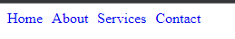
</header>Here we'll create a navbar with 4 menus called Home, About, Services, and Contact. Now we'll write some CSS for responsive view.
#mainNav ul {
  list-style: none;
  margin: 0;
  padding: 0;
  display: flex;
}

#mainNav ul li {
  margin-right: 10px;
}

#mainNav ul li a {
  text-decoration: none;
}
#toggleNav{
	display : none;
}

/* Styles for the navigation menu in mobile view */
@media (max-width: 768px) {
  #mainNav ul {
    display: none;
  }
  #toggleNav{
	display : block;
}

  #mainNav.open ul {
    display: flex;
    flex-direction: column;
  }
}
here we'll take only 768px for our responsive view as an example. Where we'll hide our menu in responsive view and show a toggle button instead of the menu. And by clicking on that button we'll show the navigation. And for that purpose, we'll write some JS code. So, let's write the below JS code to fulfill our requirement.
const toggleNavButton = document.getElementById('toggleNav');
const mainNav = document.getElementById('mainNav');

// Add event listener to the toggle button
toggleNavButton.addEventListener('click', function () {
  mainNav.classList.toggle('open');
});
So, our final code will look like below.
<!DOCTYPE html>
<html>
<head>
	<meta charset="utf-8">
	<meta http-equiv="X-UA-Compatible" content="IE=edge">
	<title>How to Build a Responsive Navigation Menu with JavaScript</title>
	<link rel="stylesheet" href="">
	<style>
		#mainNav ul {
  list-style: none;
  margin: 0;
  padding: 0;
  display: flex;
}

#mainNav ul li {
  margin-right: 10px;
}

#mainNav ul li a {
  text-decoration: none;
}
#toggleNav{
	display : none;
}

/* Styles for the navigation menu in mobile view */
@media (max-width: 768px) {
  #mainNav ul {
    display: none;
  }
  #toggleNav{
	display : block;
}

  #mainNav.open ul {
    display: flex;
    flex-direction: column;
  }
}
	</style>
</head>
<body>
	<header>
  <nav id="mainNav">
    <ul>
      <li><a href="#">Home</a></li>
      <li><a href="#">About</a></li>
      <li><a href="#">Services</a></li>
      <li><a href="#">Contact</a></li>
    </ul>
  </nav>
  <button id="toggleNav">Toggle Navigation</button>
</header>
</body>
<script>
	const toggleNavButton = document.getElementById('toggleNav');
const mainNav = document.getElementById('mainNav');

// Add event listener to the toggle button
toggleNavButton.addEventListener('click', function () {
  mainNav.classList.toggle('open');
});
</script>
</html>And if we run this script in our browser, we'll see the below output
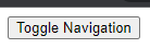
Now if we go to the responsive mode (which is 768px in our case), we'll see the below output
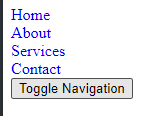
And if we click on the button then we'll see the following output
That's it for today. I hope you've enjoyed this tutorial. Thanks for reading. 🙂