SweetAlert2 Modal Notification Example in Vue.js
Today we will learn how to integrate SweetAlert2 in Vue.js. We know that SweetAlert2 is a beautiful, responsive, customizable and accessible (WAI-ARIA) replacement for JavaScript’s popup boxes. Let’s integrate into our vue.js project.
Table of Contents
- Install SweetAlert2 and Configure
- Example: Basic
- Example: Message with a custom image
- Example: A title, an error icon, a text, and a footer
- Example: A confirm dialog
Step 1 : Install SweetAlert2 and Configure
Using npm or yarn, we can easily install SweetAlert2 in our project:
# npm
npm install vue-sweetalert2

# yarn
yarn add vue-sweetalert2
We have installed VueSweetalert2. We need to add VueSweetalert2 in main.js file.
import Vue from 'vue'
import App from './App.vue'
Vue.config.productionTip = false

import VueSweetalert2 from 'vue-sweetalert2'
Vue.use(VueSweetalert2);

new Vue({
  render: h => h(App),
}).$mount('#app')
Step 2 : Example: Basic
Let’s try to display a basic notification. Copy this code:
<template>
  <button v-on:click="sweetAlertDisplay" type="button" class="btn btn-info">
    Basic
  </button>
</template>

<script>
  export default {
    methods: {
      sweetAlertDisplay() {
        this.$swal('Basic', 'This is Basic', 'OK');
      }
    }
  }
</script>
The output:

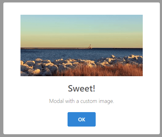
Step 3 : Example: Message with a custom image
Here’s the code:
<template>
  <button v-on:click="sweetAlertDisplay" type="button" class="btn btn-info">
    Try Me!
  </button>
</template>

<script>
  export default {
    methods: {
      sweetAlertDisplay() {
        this.$swal({
        title: 'Sweet!',
        text: 'Modal with a custom image.',
        imageUrl: 'https://unsplash.it/400/200',
        imageWidth: 400,
        imageHeight: 200,
        imageAlt: 'Custom image',
        animation: false
        })
      }
    }
  }
</script>
The output:
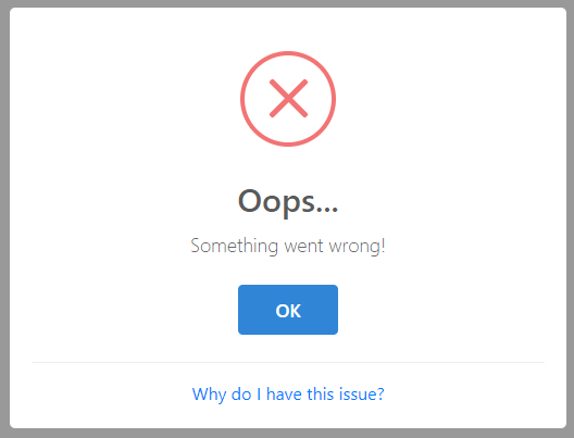
Step 4 : Example: Example: A title, an error icon, a text, and a footer
The code:
<template>
  <button v-on:click="sweetAlertDisplay" type="button" class="btn btn-info">
    Try Me!
  </button>
</template>

<script>
  export default {
    methods: {
      sweetAlertDisplay() {
        this.$swal({
          title: 'Oops...',
          type: 'error',
          text: 'Something went wrong!',
          footer: '<a href>Why do I have this issue?</a>'
        })
      }
    }
  }
</script>
The output:
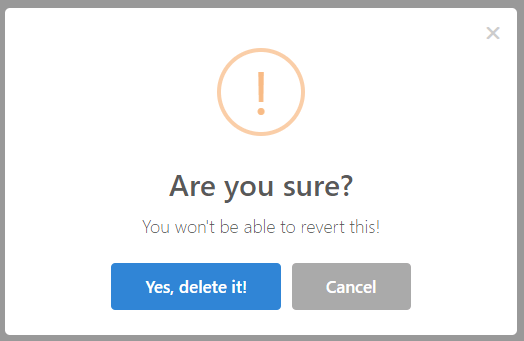
Step 5 : Example: A confirm dialog
The code:
<template>
  <button v-on:click="sweetAlertDisplay" type="button" class="btn btn-info">
    Try Me!
  </button>
</template>

<script>
  export default {
    methods: {
      sweetAlertDisplay() {
        this.$swal({
          title: 'Are you sure?',
          text: 'You won\'t be able to revert this!',
          type: 'warning',
          showCancelButton: true,
          confirmButtonText: 'Yes, delete it!',
          cancelButtonText: 'Cancel',
          showCloseButton: true,
          showLoaderOnConfirm: true
        }).then((result) => {
          if(result.value) {
            this.$swal('Deleted', 'Successfully deleted', 'success')
          } else {
            this.$swal('Cancelled', 'Cancel deletion', 'info')
          }
        })
      }
    }
  }
</script>
The output:
We are done. You will find more example at SweetAlert2’s API Documentation.
The article is over. Thanks for reading.
Md Obydullah
Software Engineer | Ethical Hacker & Cybersecurity...
Md Obydullah is a software engineer and full stack developer specialist at Laravel, Django, Vue.js, Node.js, Android, Linux Server, and Ethichal Hacking.